15 February 2017
13 October 2011
A glass of wine?
Some time ago we created a label for a wine called Wallflower for Larry Cherubino's Ad Hoc range.
The black and white image was a glass light pendant that hung in our lounge room at the time. It was an old, but very beautiful light. In this photo it looks like the petals of a flower – or a skirt, or a dress.
If you tip the room sideways, or upside down, it might have been a flower growing out of a wall. All it takes is a change of perspective. Hence, the wallflower.
The illustration is based on an intaglio print Peter made at the Australian Print Workshop. Below is a poster based on the original label graphics.
 |
| Fusebox Design |
Yulka
Here's a beautiful image of Yulka, a beluga whale, at the Arts and Sciences Oceanographic Centre aquarium in Valencia. Beluga whales live for up to 40 years. She looks very gentle and wise.
10 October 2011
Dreaming
Am not sure why, but I feel a need to be sitting in that chair, looking out over the garden. A perfect place to be on a summer afternoon.
04 October 2011
Kookaburras
03 October 2011
02 October 2011
26 September 2011
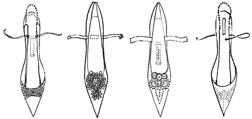
The shoe fetish continues
23 September 2011
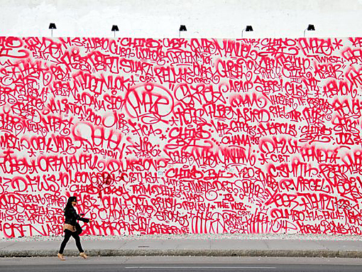
Mural
22 September 2011
Tones of grey
20 September 2011
Simply simple
Subscribe to:
Posts (Atom)

